TRACKR TROLLR.
UI/UX Design
DEMO VIDEO
Created with Adobe After Effects. Music by www.bensound.com
TOOLS
Adobe XD, Sketch, After Effects, Apple Pages
DURATION
1 month
Trackr Trollr. is an app I designed for my midterm for my Web/App Product Design class at Parsons in my Junior year.
For my project, I had to find a topic that was interesting to me. I always love hanging out with my friends and knew that an app that I would personally use is an app I'd end up enjoying creating.
First I determined my app's value proposition, the problem that it was solving, and started the process of designing it.
Define
CONCEPTUALISING THE TOPIC
Being able to create anything means that I knew this was my chance to explore a concept and/or interface that really interested me. I’m really interested in exploring human relationships and the way we communicate with each other in this digital age. I thought about my own experiences and an app I wish existed in a certain situation that a lot of people find themselves in. I immediately thought about the times I’ve gone out with friends (and maybe lost one or two by the end of the night), and how having an app that allowed us to track each other while also keeping everyone engaged would be super helpful. I’ve never heard of a tracking app that functioned like a game and thought this was an idea I’d want to explore.
PROBLEM SPACE
— Many people don’t use tracking apps when they go out at night, despite this being an important time to because of how tedious and boring they are.
Tracking can often have a negative connotation making people not want to do it…but what if tracking was made fun, interactive and social for the whole group?
How might we make tracking fun and interactive for the youth while simultaneously maintaining the aspect of safety?
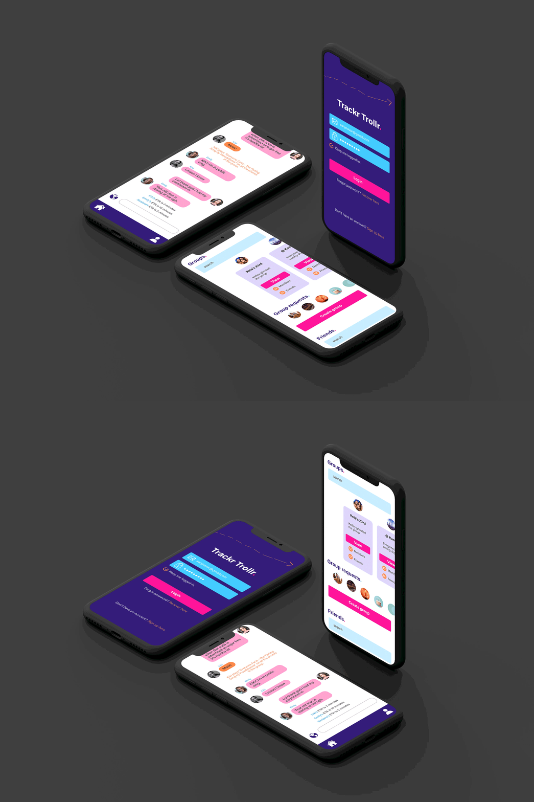
Trackr Trollr. is an app that allows you to track your friends on outings while also having fun! The app uses a chat interface that allows you to: get live ETA updates, a map of the locations of all your friends in the chat, and use specific words and phrases to enable certain interactions (ghosting, infinite type, play music on phones, etc). To keep the aspect of safety still embedded in the app, certain interactions have a limit to how many times you can use them.
Research
COMPETITOR ANALYSIS
I looked at two competitors, Glympse and Find My Friends. Both apps had the fundamentals of tracking people who share their location with you. Another app, Life360 allows users to track cell phone battery life, location history, and with a subscription, driving reports, crime alerts, and crash detection.
I wanted to create an app where users could choose how to control their location in an interactive and fun way without just having the option of turning location on or off with a button.
Design
USER FLOW
This was the initial user flow diagram that I made before starting the design process. It shows the most basic screens. Some screens have been removed later and others have been added.
The main changes I made to this flow besides going more in depth was giving importance to interactions in the chat. In this flow I only mention few such as ETA updates and the off route notification, but the app ends up focusing more on these types of interactions.
WIREFRAMES
LANDING PAGE
The landing page shows all your friends as well as groups you can create or join.
The buttons at the bottom are drop downs.
MAP
The map navigation allows you to see your friends locations. You have the option to disable your location in the general map.
IN CHAT INTERACTIONS
In order for this app to be fun and usable, I wanted there to be a game-like feel to it. I tried to achieve this through popups, colors and fun effects.
Fun effects include getting a popup when you go off route or ghosting your friends when you want to go off route without them knowing.
As this app is still about safety, most effects have a use and time limit.
Test
After making the wireframes, I had my classmates and potential users test a prototype and offer suggestions. There were some drastic changes I made to stay in line with the app's value proposition.
I REMOVED MOST POPUPS
They were distracting and killed the 'fun' mood I was going for.
They ruined the rhythm of the chat. Having to continuously close popups isn't fun.
I REMOVED INTERACTIONS THAT WERE IRRELEVANT TO THE CHAT
Having a button that makes cats popup on your screen can be cute, but they aren't really related to the chat.
They don’t involve interaction between the users.
I ADDED INTERACTIONS THAT INVOLVED THE USERS MORE
Examples of this are infinite type and being able to play videos and music on all the phones in the group without consent.
I REDUCED THE AMOUNT OF CONTENT ON A PAGE
In the chat, there are many buttons.... in fact there are too many. Buttons also feel detached and I wanted the interactions to be more embedded in the chat. In order to achieve this, I removed the buttons and replaced them with in-text interactions.
Buttons also felt too much like applying a filter which makes the interaction not meaningful to the chat.
Iterate
MOCKUPS
LANDING PAGE
For the homepage, I redesigned it from the wireframe to be more interesting for the user. Also in the wireframe, the buttons at the bottom were not that user friendly with the small space and the intention for them to be drop downs.
Instead of having just your friends list, now you can see your groups as cards, your group requests as well as your friends.
CREATE GROUP
You can add people to create a group. You can also add a photo for your group and give it a name.
IN-CHAT INTERACTIONS (PLAYING SONGS IN THE GROUP)
One of the fun interactions in the app is the ability to play songs on your friends phones. There’s many such interactions.
Effects like this make the journey so much more fun and interesting for all the people involved that it feels like you’re playing a game on the way.
Instead of the loud popups in the wireframes, these feel much more like a part of the app and don’t detach the user from the chat.
END OF CHAT
When the app has detected that everyone has reached, it gives everyone in the chat an option to continue or leave.
If you stay in the chat, you will be able to track them in the chat map as well as change destinations if the group is still on the move.
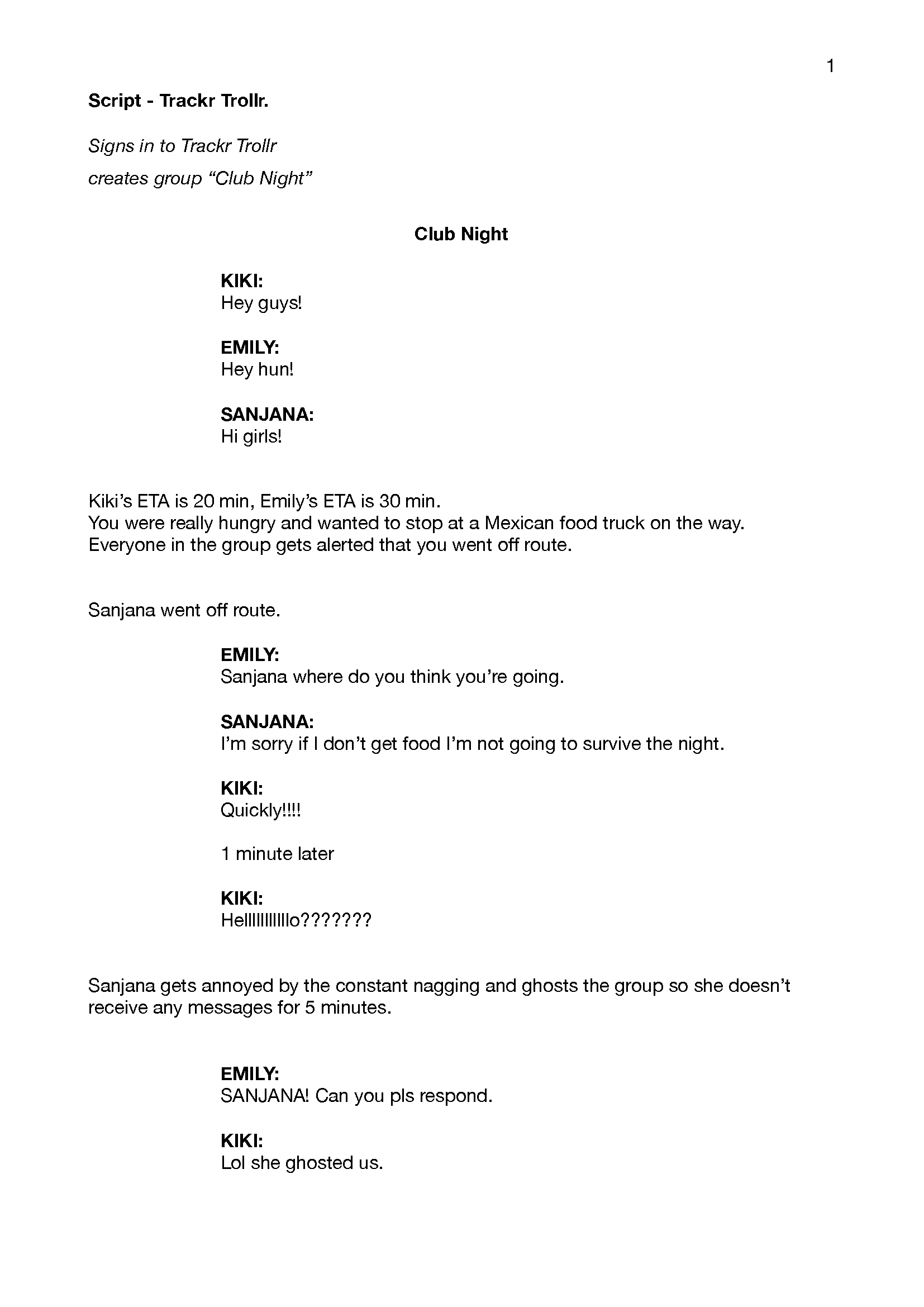
SCRIPT
TAKEAWAYS
With the time I had to do this project, focusing on the chat was my main priority as it is what makes my app unique. There is definitely room to still explore other interesting interactions and how this app could expand into other uses.


